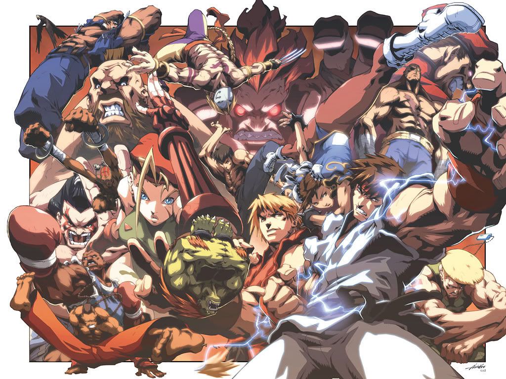
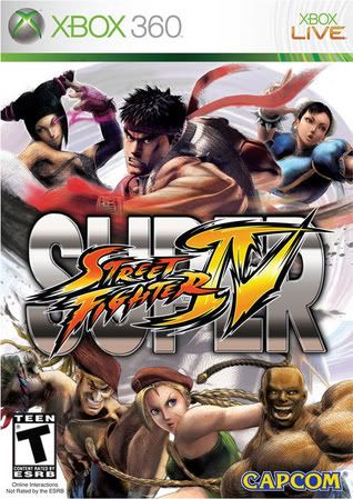
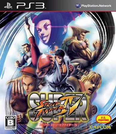
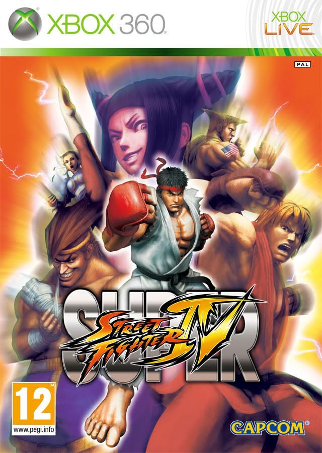
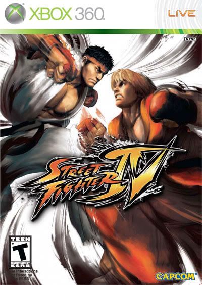
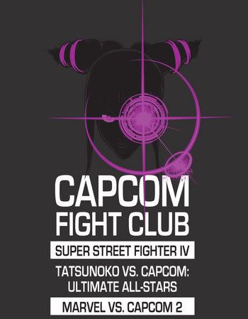
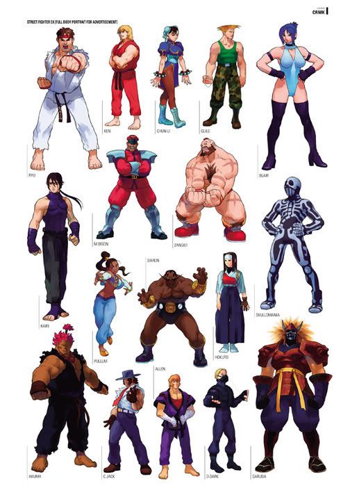
Capcom has revealed the box art, some new character sketches, a release date and a ton more information about the upcoming title. The main theme of all these updates has been general disappointment. Nothing extraordinary is in the works, nothing that merits a $50 price tag for a "new" game which is made up mostly of "improvements" to an existing title. In other words so far it really does look like a money grab. Let's look at these things individually.
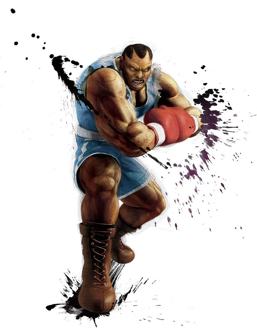
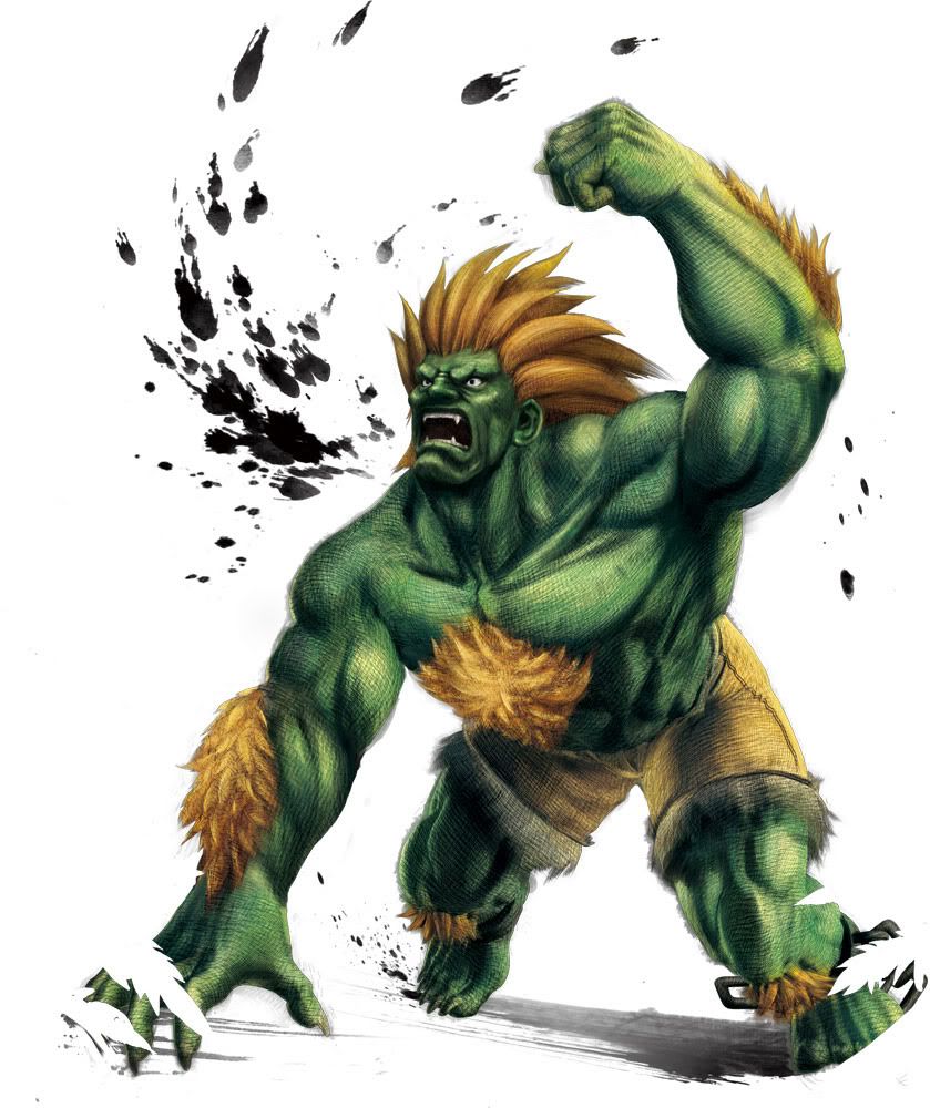
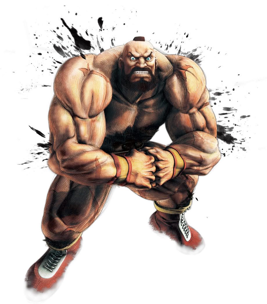
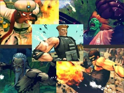
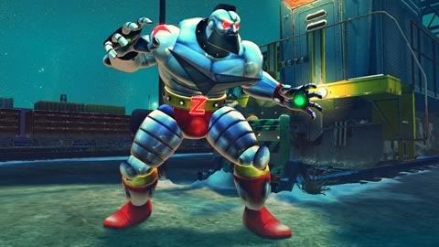
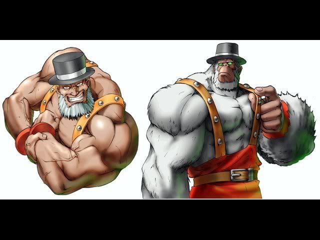
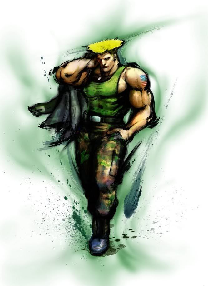
The new art is horrible. Yes I talked about it before, when it was first released and I was liking it at the time. But the stuff I've seen recently is beyond atrocious especially considering what the art for SF4 looked like or even what Udon is doing with the franchise. This new style, that looks like either pastels or cloth depending on how high you are, has no dynamism at all. There is no sense of action, of movement, the characters look bland, uninspired and deformed. By god look at what they did to poor Zangief!
This leads directly to the box art which is nothing more than a copy and paste of the previously mentioned character art. It's beyond boring, nothing is happening on that box. The Japanese and European boxes are a bit better but not great either, just simple photoshops of characters. They should have created something unique for the box instead of relying on clip art. How about a cover with just one character? and how about this: make that character NOT Ryu? if you insist on getting Cammy in there at all costs why not just give her the cover, or Guile, or fuck it take the SF4 cover and substitute Ryu and Ken for two of the new characters.
Speaking of new characters, nothing has been revealed since Adon, Cody and Guy and that was a few months ago. Last year even! We pretty much know that the other characters will be Dudley, Makoto, Ibuki and a new guy called Hakan. Here's the thing: I don't care for any of these. Honest. I've never played them, had they gone with a character I've actually used and mastered (Remy, Necro, Juli, Juni) I might actually be excited. And the new character? when I heard it was gonna be an Arab fighter I was way happy, then I saw what is possibly a picture of him and....its a guy in a gi. Another fucking guy in a gi? what makes him Arab? is it a special gi? Frustrating.
The other big thing: new ultras, new outfits. Some of these are gonna be great, Cammy in a tiny Bison outfit? yes please. Zangief as Colossus? of course! Dhalsim in traditional Brahmin garb? I'll take two. New ultras? also a plus but for someone who loves visuals and art as much as I do That's really a secondary bonus. The thing about it is these could have been downloadable! I would pay good money to see these costumes in Street Fighter 4. Hell I already did it once. The new characters could have been downloadable also, it would have been much more difficult to pull off sure but if Soul Calibur did it I'm sure Capcom can do it also.
See the main problem here is we're gonna be paying (a lot) of money for what amounts to DLC and a repurchase of the original game. There is not $50 worth of newbies in Super Street Fighter 4, that would be impossible. It's also not a new game yet they want me to spend the same money I spent for Modern Warfare 2. I don't fucking get it, is Ghost gonna be a playable character? I didn't think so.
So in the end: it'll be worth it once it trickles down to $15 on Amazon. Which is only fair because the announcement of this game made my SF4 worth about that much. I'm sure it'll sell like hotcakes to the rest of the Street Fighter nerds (my fellow nerds I should say) but I'm simply gonna have to pass (for now at least). There are too many good new games out there and this is merely good bonus content for a game I already own.
Tuesday, February 2, 2010
708 Words on Super Street Fighter IV
Thursday, December 3, 2009
A Downward Spiral
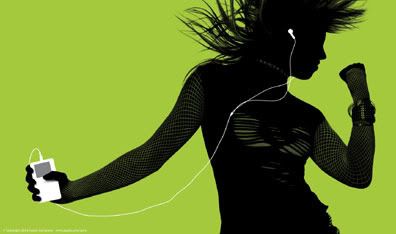
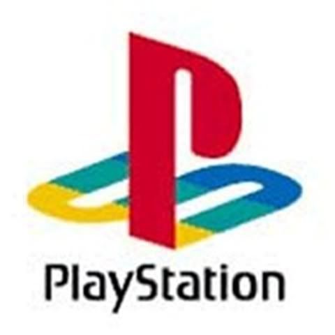
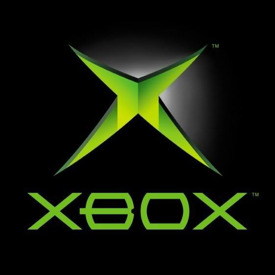
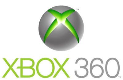
The objective is to engrain an image into the consumer's mind so that as soon as a brand is named (or read or whatever) there is an instant visual accompanying it. Think of the Wii and you think of the odd remote, the over reliance on white. Think of an iPod and you think of white headphones and those shadow commercials they use to run. Think of Playstation and you instantly picture oppression and the long used PS logo. What about the Xbox?
Simple right? the green gash that was used for the original Xbox. When its laid out in black its the original, for the 360 Microsoft paired it with white. You put the gash in a globe, add some nice colors and font and you get the Xbox 360 logo. A pretty, Web 2.0 identity that says "yes we're for hardcore gamers but we also care about families, we're not oppressive oligarchs like Sony but we're not pussies like Nintendo".
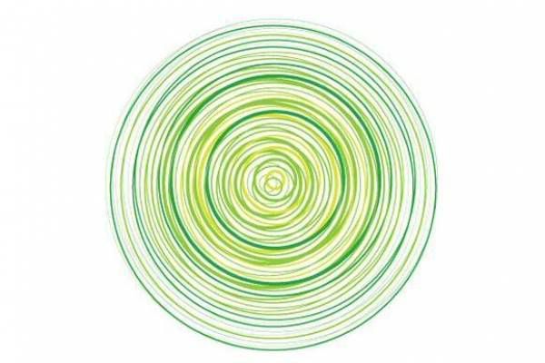
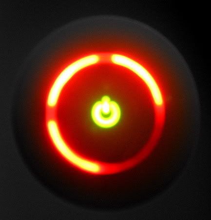
But the thing is that was not the original Xbox 360 logo. When it was released the overlying visual was the psychotropic, green-yellow-white-blue, moving, mind fuck spiral. When the 360 was released in 2005 Microsoft had that spiral everywhere, but after some time (and I couldn't tell you when) it went away, replaced by the sphere and the wordmark. Sure its still used today but its hardly the primary mark. So why did it went away? some thoughts below.
Firstly the spiral is impossible to reproduce, especially on a small scale. Imagine trying to get that thing on a polo shirt and have every individual strand appear as it does on a computer screen or a piece of paper? its impossible. Any logo needs to be reproduced on all sorts of scaled and the spiral simply does not work. Add to that the huge amount of negative space in it and the fact that that space probably has to be filled with white and you have a logo that is impossible to work with.
The X-gash is not only part of the visual identity but its actually part of the controller, going to it as the main visual simply makes sense from a marketing standpoint. The spiral, at most, is part of the box and the box gets thrown into the trash after you make sure your system works.
Could it also be that a spiral as a video game logo has been done before? specifically by Dreamcast? I suppose. Though the Xbox and the DC's spirals have very little in common, I'd say nothing except for the basic shape and the fact that they both appear on machines that are primarily white in color. The thing is that by 2005 the Dreamcast was obsolete, Sega was out of the hardware business and fear of litigation should have been minimal. It probably was since the Xbox spiral still technically is part of the larger visual package.
The answer is probably a short google search away and its probably not as romantic as the shit I'd like to believe so I'm just going to assume I'm correct in assuming that the logo's uselessness and its similarities to the Sega system ultimately killed it. In the end if I were Microsoft (and I'm not) I would have gone with the one visual that comes to everybody's mind when they think Xbox 360: the Red Ring of Death.
Oh Snap!
Saturday, November 21, 2009
KOF meets NBA
Well now I can't decide whether this flickr gallery of mashups of NBA players and King of Fighters is the worst thing ever or the best thing ever. I think I'm gonna go with best.
Let us now count down how this in fact is the best thing to happen to the SNK franchise in years:
-KOF: Maximum Impact brought 3D action to the 2D stalwart. This would be great if it wasn't for the fact that the characters suffered from heavy polygonitis and the gameplay was choppy at best. It also relied heavily on a few new characters who were frankly horrible.
-Bankruptcy in 2001.
-The release of King of Fighters XII with brand new, beautiful sprites. Too bad the game has been universally panned as incomplete and lacking in replay value. That games like Blazblue and Guilty Gear had already taken KOF's 2D throne didn't help, that Street Fighter made a marvelous return with SFIV didn't help either.
-There's a new KOF live action movie coming up with promises to be horrible. It's so bad that it probably already did come out but nobody cared.
Yes, the fact that somebody decided to photoshop Shaq as Chang Koehan (and keep the beard) is definitely the best thing to happen to King of Fighters this decade. Ok, except for the adorable alternate costume Leona had in Maximum Impact.
Monday, November 9, 2009
I Will not title this "Juri Duty"
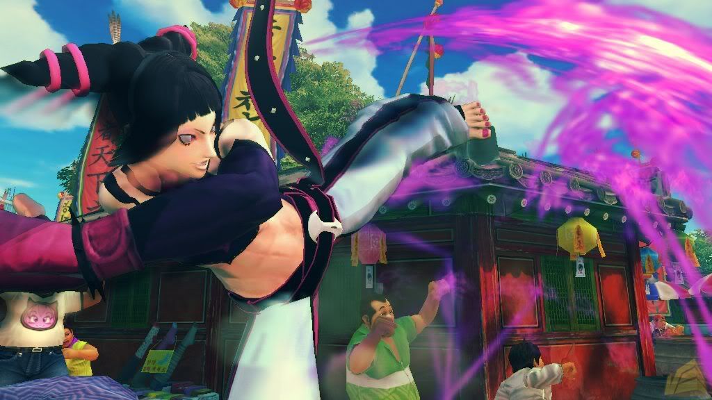
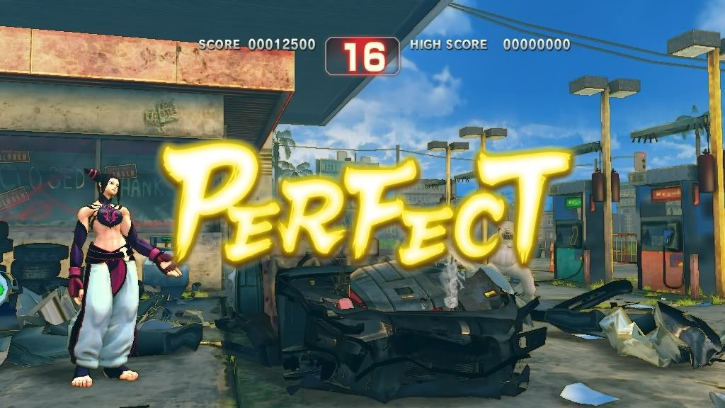
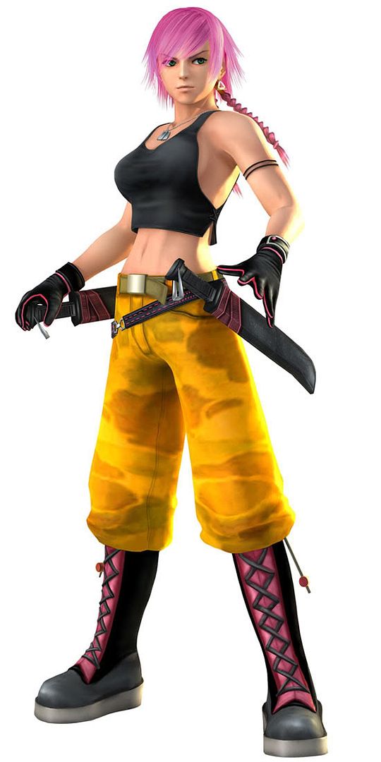
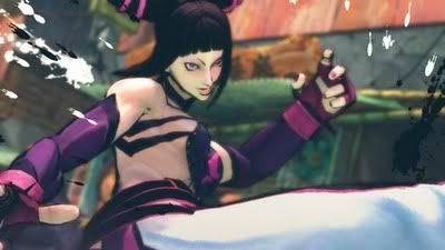
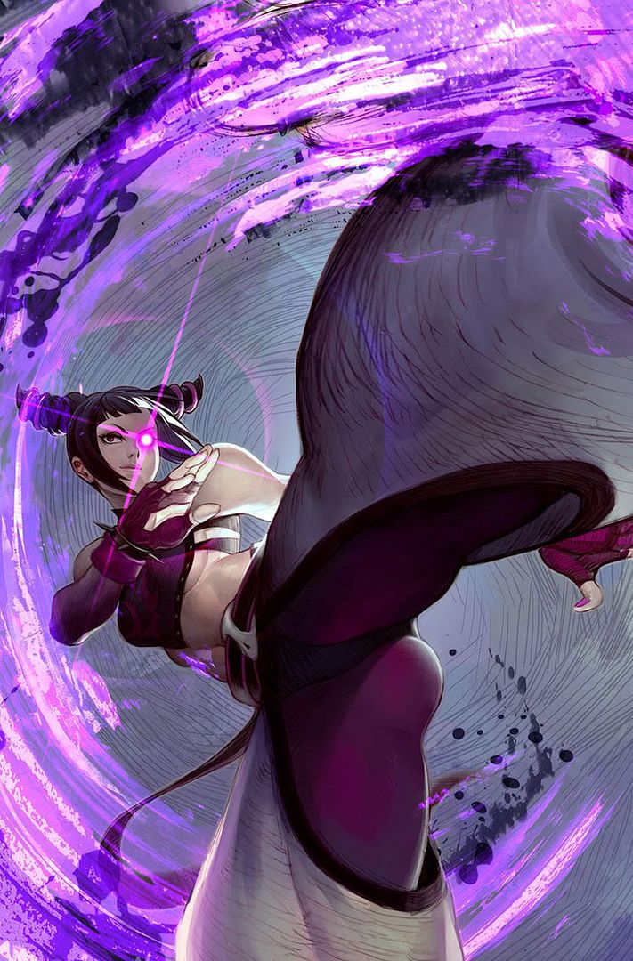
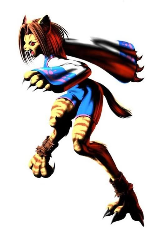
Here's the deal. When Capcom teased us with Super Street Fighter IV they did so mainly with promises of new characters. Sure the game would be beefed up graphically, musically and gameplay wise but the one thing you cant get in SFIV that you're gonna really want are new characters. Sure its a money grab but everything is a money grab, right Call of Duty Super Mega Special Collector's Edition? Hence, with money in mind, did Capcom unveil T.Hawk, Dee Jay and Juri.
The first of those two characters we know and don't much care for as that sense of discovery is long gone. But Juri is a different story altogether. She has basically been used as the face of this new iteration, she's the most palpable "new" aspect of this game and as such has been paraded all over the internet. Dee Jay and T. Hawk might make old schoolers happy but Juri is Capcom's promise of excitement to come.
With new images, information and videos being released seemingly on a daily basis I suppose now is the time to make a semi-informed decision as to what kind of character she'll be. So here's what we have so far:
She's the first Korean and Taw Kwon Doe fighter in the series. Ok this means nothing to me, not that I have anything against Korea its just that since they went away from personalized stages she could be from the fucking moon and I wouldn't be able to tell where she's from. She's Korean, that doesn't come through in any of the things she does.
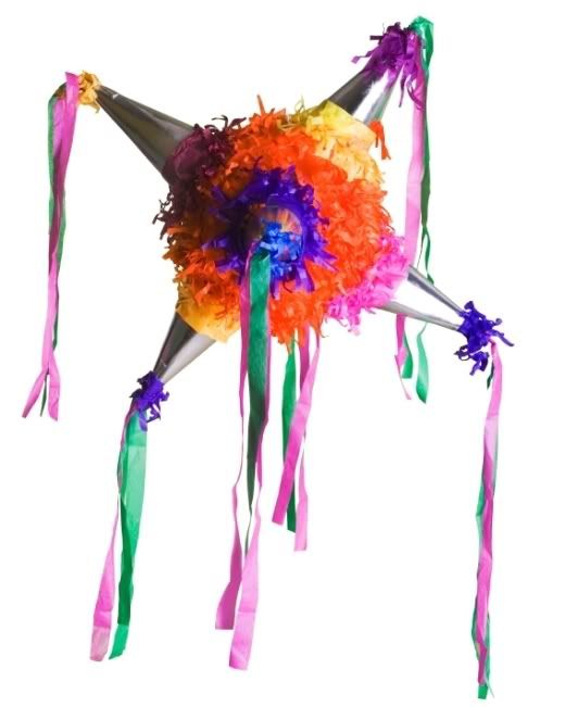
She has great kicks and two somethings in her hair. Hmm dont we already have a character with those characteristics? also those points she has for hair remind me of a pinata.
She has a beef with Bison. Storyline means nothing to me. The whole thing is too
convoluted.
She has a pretty cool fighting style. She does. It looks like she's fast and her kicks seem more powerful than Chun Li's. Yes this is a plus.
I like her design. Yes I do, I've criticized the parachute pants and hair thingies but she looks cool nonetheless. Let's be honest most of SF's designs are out there, from the old (Vega) to the new (Viper), Street Fighter isn't afraid of being out there. Sure Juri might seem a bit too fantasy-y but I'm willing to give her a chance. This isn't King of Fighters.
I could go on. Actually I couldn't but I have a video that makes my point for me. The thing with these new characters is that they're designed in 2009 to blend in with characters from 1989. It's gonna be a mishmash, its gonna be a bit off regardless of whatever design is released. The final verdict will have to wait until the game is released, we know what the rest of the characters look like and I've had a chance to play it.
Here's that video. Also: bonus stages!
Wednesday, October 28, 2009
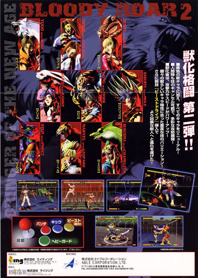
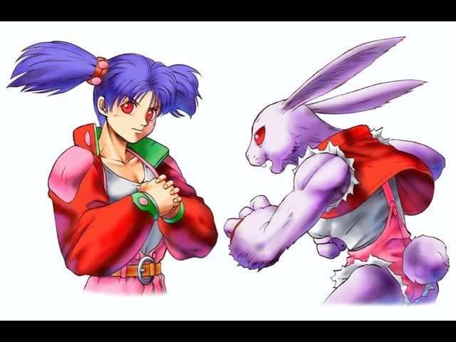
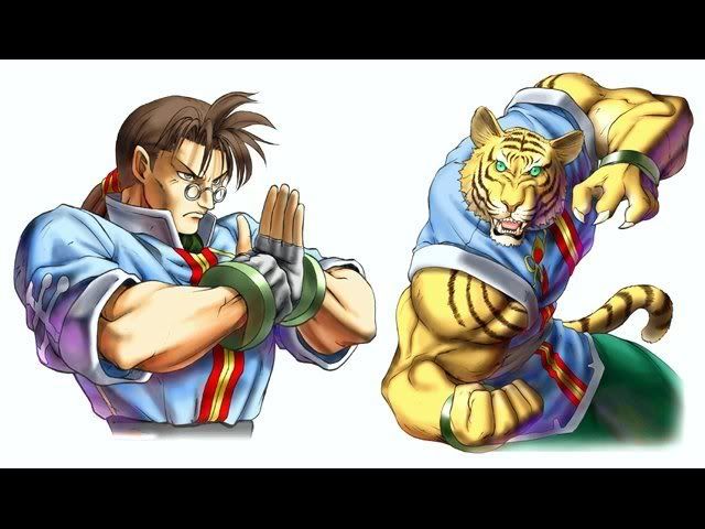
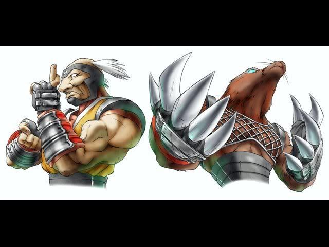
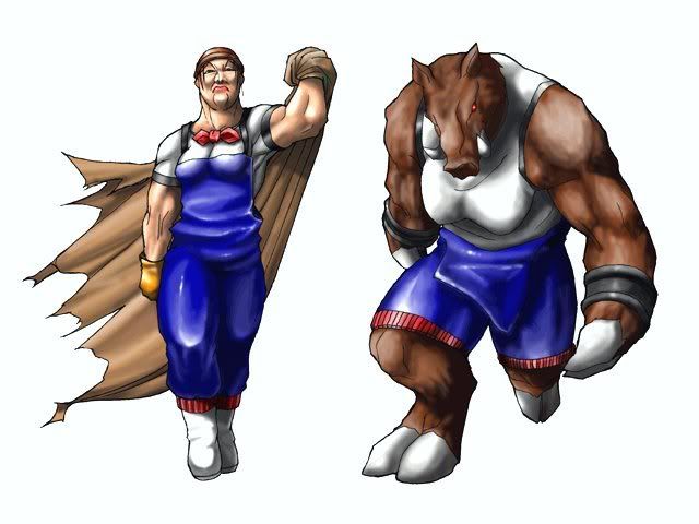
The Characters of Bloody Roar
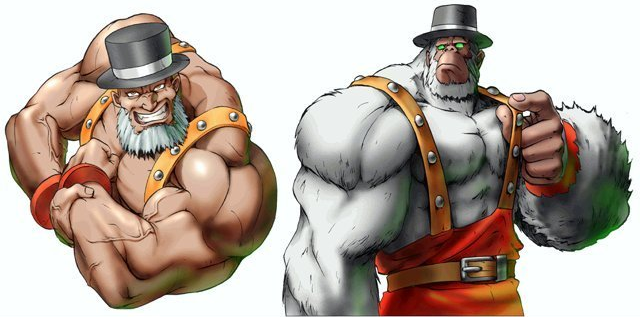
But the concept is pretty cool: a fighting game in which your character has a separate gauge that lets you transform into a fucking animal mid fight and wreak some havoc on your enemies. It's a very interesting premise, one which was sorta explored in Altered Beast but which is better done here.
The art is what fascinates me. The drawings, for the most part, have a great anime feel to them that I'd really like to see taken into a fighting game (it's not as good as BlazBlue's but nothing is). The biggest drawback, and the reason why this series isn't as beloved and why I don't even care to hunt down a PS copy for my PS2, is because the game is in 3D. Yep it suffers from the same problems as Rival Schools and that's a shame.
But we're not here to focus on that, we're here to check out some of the character designs, especially those of the first games. These characters are exceptionally well done, it's like they took the animal as a base and then created a human around said animal. The results often go overboard in their obviousness but they're still pretty cool.
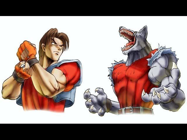
Yugo - I'm assuming he's the protagonist. A wolf, I don't really see a wolf in his design (way to ruin my thesis asshole). He's probably a loner. It's nice to finally find out where Capcom borrowed Abel's nose from.
Alice - A rabbit! First of all the hair is an obvious reference, the name is probably derived from Alice in Wonderland (which I believe features a rabbit also), I'm willing to bet she has rabbit teeth too. Oh and the red eyes, because all bunnies are murderous.
Long - A nerdy buff guy as a tiger? yeah that actually makes sense. I get the feeling tigers are a symbol for wisdom in some cultures and if that's not enough it looks like this guy is into martial arts. Tigers and Asia? sure why not.
Bakuryu - what the fuck is that? a mole? oh ok, so it makes sense that the poor guy looks like he's blind, but did they really need to give him that nose? Apparently they changed his looks from the first to the second game, they made him younger. This makes no sense, a mole isnt necessarily synonymous with youth.
Mitsuko - I'm not sure what's going on here...is that a warthog? shit, is that a woman? I have no idea but I don't want to find out either.
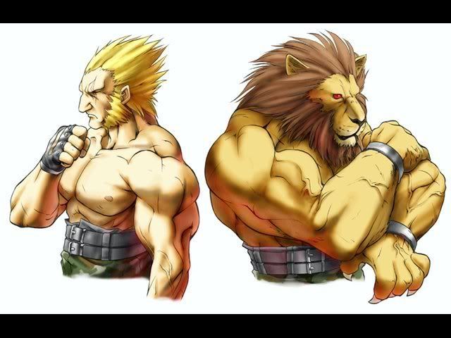
Greg - I am having a love affair with this design. The buff guy (the Zangief if you will) of the title is a fucking gorilla? no! he's a gorilla with a hat! genius. And both versions have that great beard. Too bad he didn't make it to the sequel.
Fox - Obvious name is obvious. I dont like this design, what is she some sort of body builder? no, most likely she's the Morrigan to Alice's Felicia. Still I dont like it. Seems lazy, the bodies are the same they just changed the face.
Uriko - a half cat? why did they have to break the pattern? you couldn't make her a full cat?
Gado - I have nothing to based this on but I'm saying this guy is German. Not only does he look like a lion but it looks like he's trying to look like a lion. I applaud this. Look if you're gonna be stuck as some sort of animagus for your entire life you'd might as well go all the way. A little hair gel and some mutton chops go a long way.
That's all the characters for the first game. Like I said had this game been done in 2D it probably would have been better. It's a shame it wasn't, it's a shame it decided to go with what was hip at the time and it's a bigger shame that they couldn't even do that right.
Saturday, October 24, 2009
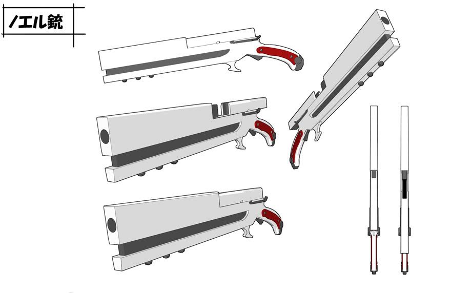
Noel Vermillion's Gun
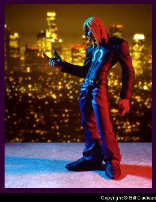
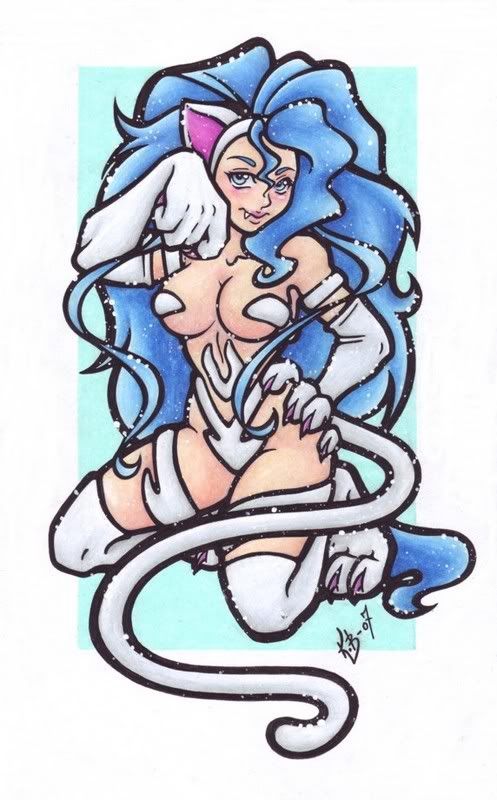
It deserves its own post. I don't know if I should fear it, look for it in my cereal box or create my own out of discarded cardboard. It's not a small secret that I'm a BlazBlue, nay a BlazBlue art, fan and her dual shotguns have to be my favourite part of the game. Ok so every part of this game's art are my favourite but those are some great guns.
Tuesday, October 20, 2009
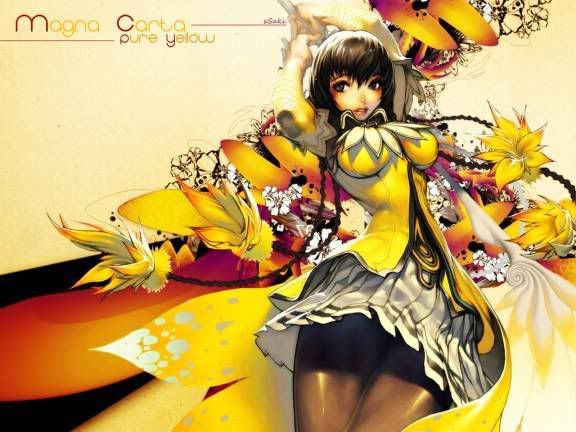
Magna Carta
How is it that I never heard of this game until today? I don't so much care for the game, I haven't seen any screengrabs or gameplay videos but damn look at that art. I never realized that the Koreans actually had it in them.
It's times like these that I really appreciate Blogger not having any minimum word requirements per post.
Friday, October 16, 2009
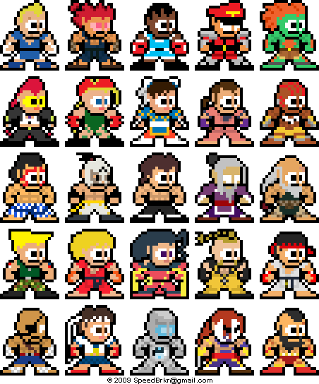
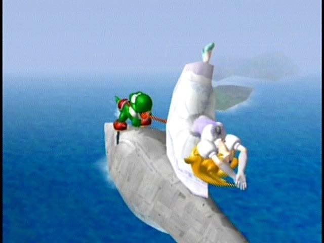
Street Fighter + Mega Man
For the past two days I've been looking for an excuse to post this picture. Finally I gave up and determined that I have no need for excuses. I mean just look at those things! I have no idea which one I like more, I really do want to just hug and squeeze all of them
Found here.
Monday, October 5, 2009
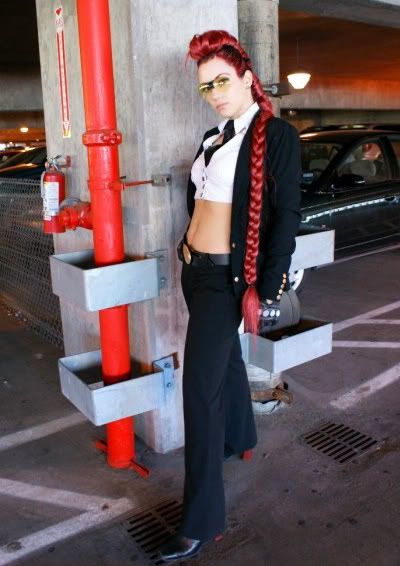
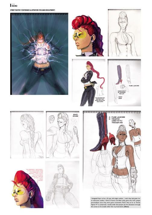
Viper, Sagat, New Art
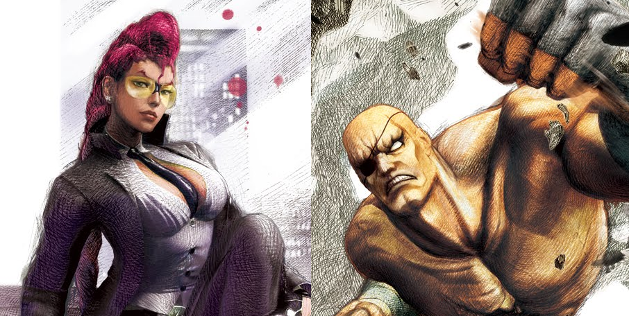
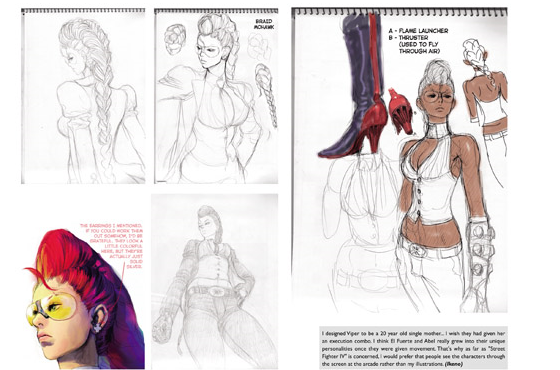
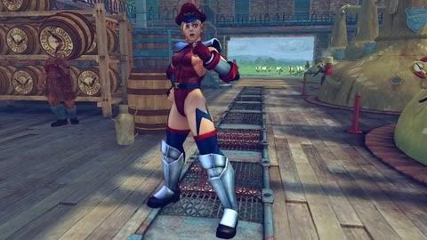
It should be noted that the new game will likely have all new artwork for all the characters done in a style that is a departure from the SFIV "ink" style which not only functioned as official artwork but also played a part in the gameplay in the form of the character's focus attacks. The new artwork doesn't suck but it lacks the kick that the ink style had. They're nice drawings and all but the chalk/pencil thing is inferior to the ink thing. It just is. I'm not saying I wouldn't pay money for an artbook but its not as good as the former is all.
As for these two particular drawings, I do like them. It's hard to characterize Sagat as anything other than a bad ass so any drawing of him will look like we've seen it before. As for Viper, her appearance is too odd and specific to really do anything with it. Long braided red hair, glasses, black outfit, not much room for modification. They gave her the standard Street Fighter thunderthighs, accented her curves and made her usual smirk a bit too subtle.
Also what is going on with those backgrounds? Sagat is breaking some meteors while Viper sits on the side of a futon? I vote we go back to the old solid color backgrounds.
Tuesday, September 15, 2009
The Internet Museum of Awesome
If there's something that is sorely missed now that we have transitioned to the user generated Web 2.0 is the old dedicated sites. Be it on geocities or lycos, be it a site devoted to pictures of a particular celebrity or to Zangief there was a sort of relief from finding out that not only did someone else share your niche obsession but they have also gone through the trouble of collecting pictures, interviews and data all in one place.
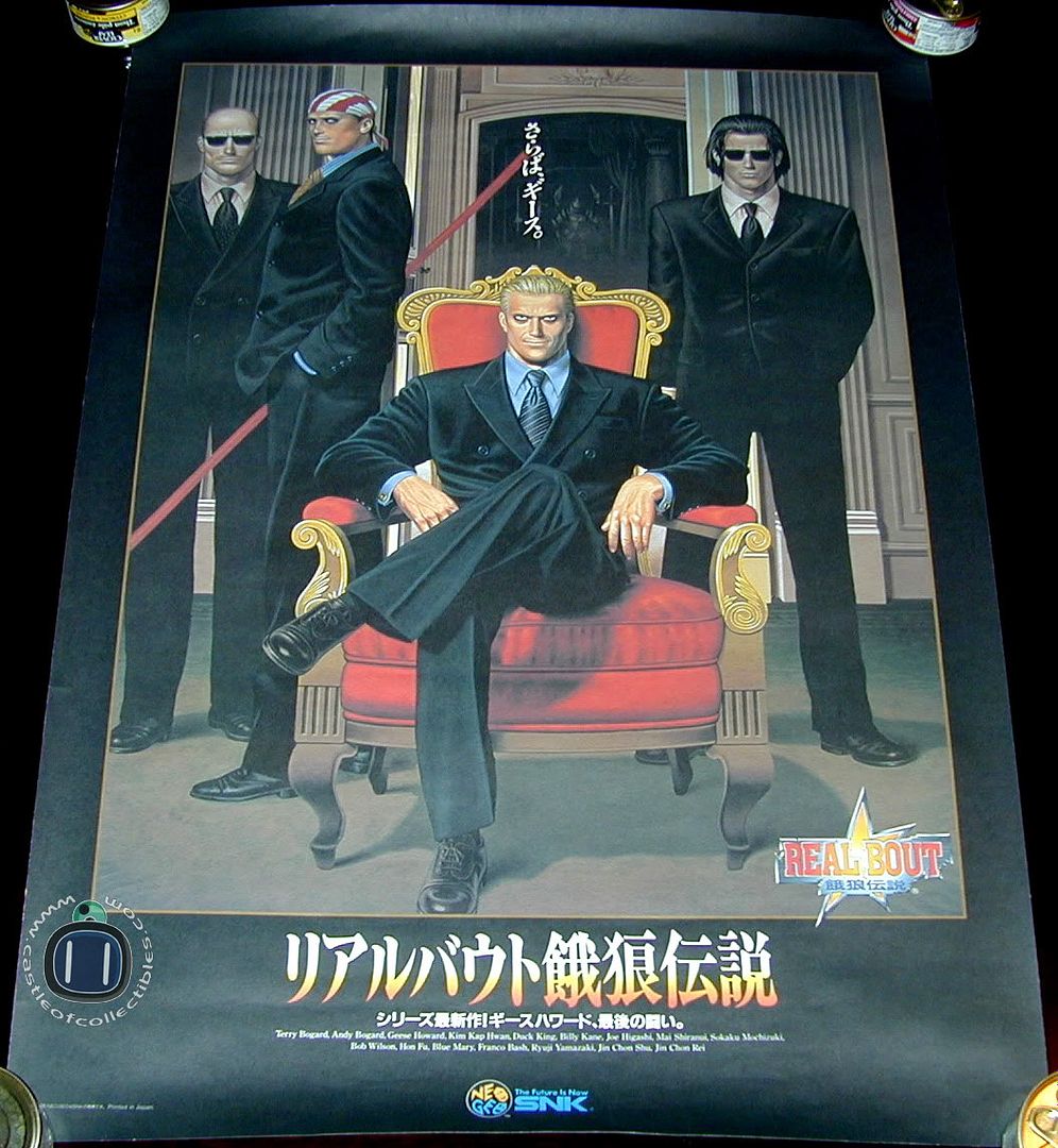
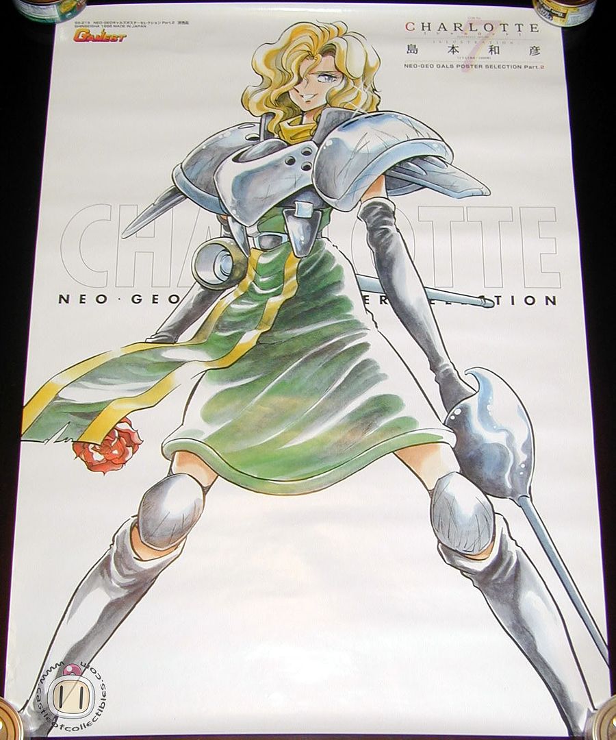
But most of these personal sites are now either gone (like the Zangief Shrine which I could not link to above) or have been replaced by celebrity rags, user blogs or social networking sites. It is therefore a true pleasure to discover a site as devoted as the castle of collectibles. This place has a huge amount of posters and other media not only from the old SNK/Neo Geo games but also the current generation.
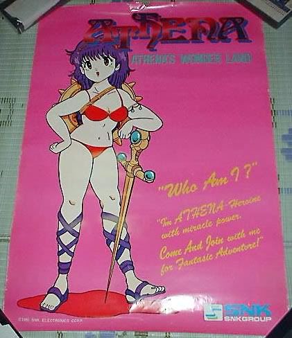
The gallery might be a dancing baby short of coming straight from the late 90's but the layout is meaningless when compared to the amount of awesome that the website houses. Posters range from the very early, cartoony ones (at the apex of video game kitsch) to some truly magnificent examples (that last one, by the way, one of my favourite ever SNK pics, heres a better look). The great thing is that the guy who runs the site has most of the posters and the pictures posted are of the actual item.
Of course if posters are not your thing there are other sections, including a graph that shows you what games are available for what system and the Vault which houses a ton of old Neo Geo memorabilia, so much in fact that it comes with an old school warning for dial-up users. Yep, this site has so much kitschy goodness and do want that its hard to quantify in a single post, luckily its still there and is actually updated frequently so its a great time waster. I'm adding a links section and this is definitely going on it. It's times like these I wish I had the disposable income to foster my obsessions.
Check it out here
Neo BomberMan's Castle of Collectibles
Friday, September 4, 2009
Tuesday, August 18, 2009
Estrogen!
Some genius came out with a flowchart for Total Eclipse of the Heart today which might possibly be the greatest thing ever on the internet. The bad news is that since I saw it this morning I have not been able to get that damn song out of my head.
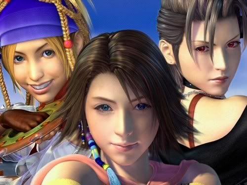
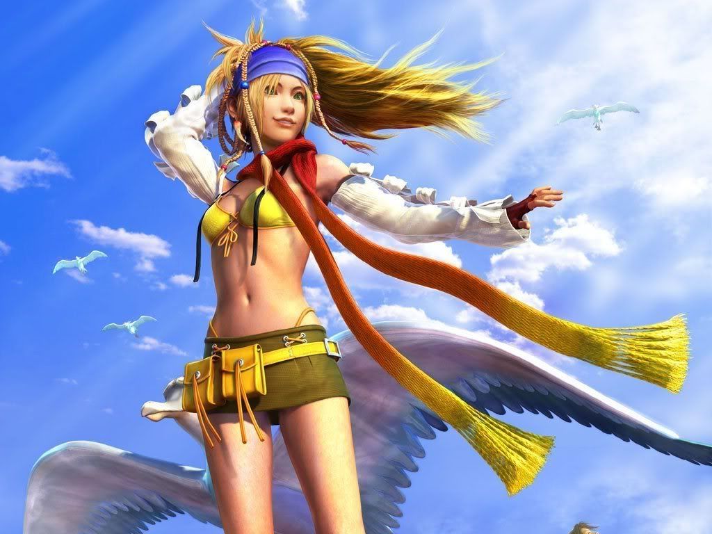
To commemorate the occasion lets talk about the most estrogen-filled woman power game of all time: Final Fantasy X2.
The only game in the much beloved Final Fantasy franchise to be a true sequel, X2 had you walk around as three female archetypes who were either trying to be in a girl band, save a planet or a marriage...I really dont remember. Fact is as soon as the J-Pop started to blast from my PS2 (and that was really quickly) I regretted buying the game.
Oddly enough the game was really popular even among male video game players, it probably had something to do with the outfits the three characters wear throughout the game. I mean what the fuck is this? I dont know but it leads to this and that leads to continued profit.
$$$$$
I played it for a few days and have no idea where it might be right now.
Thursday, August 6, 2009
The Accidental Video Game Porn Archive
The accidental video game porn archive is a site that would not have been possible in those days, not only because of the difficulty of starting your own website but also dealing with limited technology that made gathering pictures, videos and so on impossible.
But this is no longer the case and now we are able to take old video games (which this blogger loves, obviously) and meticulously gather all the instances in which pornography accidentaly takes place in them.
The results are amazing, and they are grouped into handy categories depending on what type of pornography is occurring. The owner has also made life easier on us by separating each instance by alphabetical order, all served in a layout that is deliciously reminiscent of geocities.
The archive is huge, it includes situations from old games, new games, games we love, games we dont, games we've reviewed and even some that make this blogger very uncomfortable. Its a fucking cornucopia of awesome.
Check out tons more right here:
The Accidental Video Game Porn Archive
Tuesday, July 28, 2009
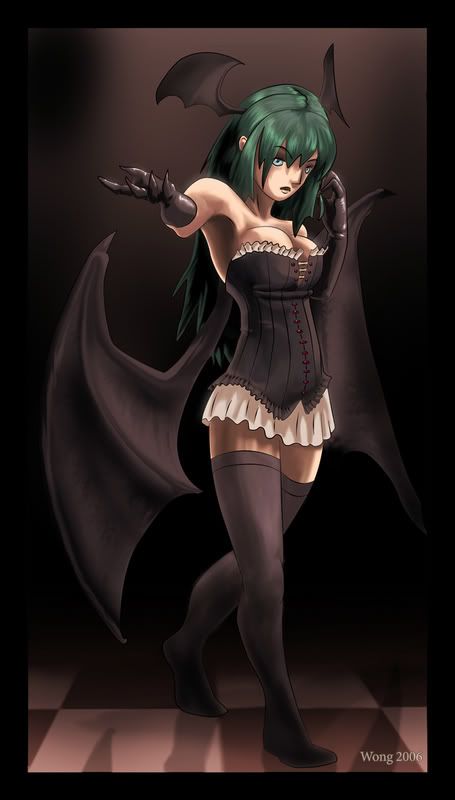
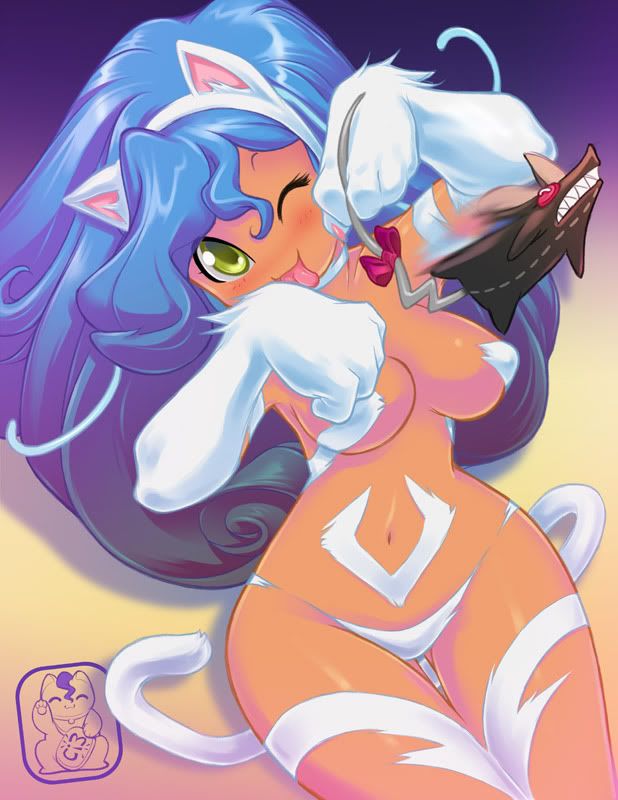
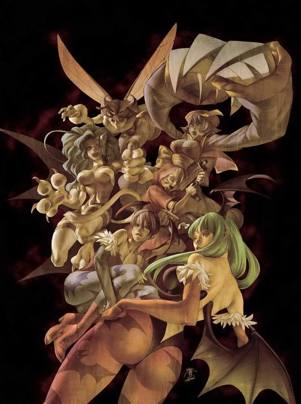
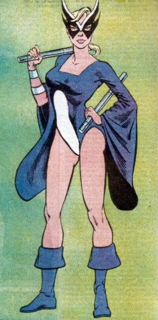
Lady Pictures
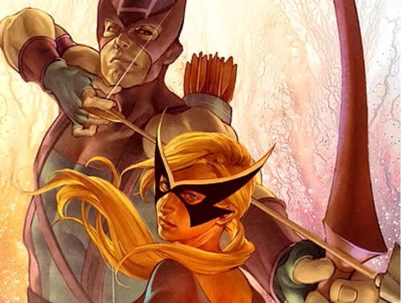
"I realize that Darkstalkers is a franchise known primarily for having half naked cat ladies and succubi and though I dare not ask artists to tone it down did they really need to increase it?... look at that fuckin cover? way to rob the book of any dignity by featuring such a prominent thong"
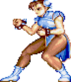
Good to see copying from blogger keeps the links by the way. The point is both gaming and comic book nerds get a bad rap because their interests are so male oriented that creators often overdo it when it comes to the sexual nature of their products. This has been a problem since the beginning for comic books because art was not technologically limited in the golden era of comics as it was for video games. While I am sure that Capcom, for example, wanted to create some really realistic thunderthighs for Chun Li they simply could not do it in the 1980's.
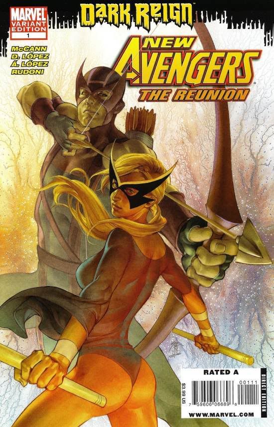
I write this because I recently ran into an example similar to that of the Darkstalkers book. The image above is part of the cover for New Avengers: The Reunion #1. Its a very nice drawing of Hawkeye and (his wife? girlfriend?) Mockingbird, so nice in fact that it made me curious as to what the book was about, but not nice enough to make me cheat on Green Arrow.
I did my research and found the title and the complete cover. My reaction was pretty close to this:
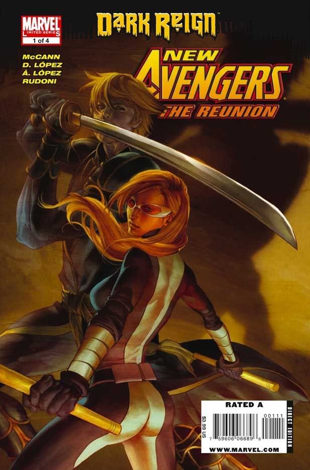
Complete fucking disappointment. As you can see the cover suffers from the exact same problem as the Darkstalkers book: ridiculously unnecessary sexuality in the form of a female character wearing uncomfortable undergarments. Lets not get into the whole "shes a superhero, why would she wear that" argument, lets focus on the goal of the artist: get an ass shot in order to sell the book. Did it work? I can see many people (women) being insulted enough to forgo the book and the entire series (a five issue mini), I can see many going for the more subtle variant, even the stereotypical nerd.
I can also see myself not buying it and its not because I'm insulted by the site nor because I'm some sort of prude, in fact I'd argue that a well done cover girl is a good thing, but rather because I'm appalled at the fact that creators feel a need to appeal to the basest instincts of all nerds. Not to mention that, like with Darkstalkers, the inclusion of the ass focal point makes the cover very unattractive. Unfortunately with the Darkstalkers book there is no variant, the horrid cover will have to grace the bookshelfs of those of us who end up buying it, forever forcing us to explain how we're not, in fact, nerdy perverts but rather just consumers with limited choices.
As for the Avengers book, I never bought it nor I have any intention of doing so. Not just because of the stupid cover but because this whole Dark Reign is starting to become kinda grating: we get it: Norman Osborn owns the world, lets focus on improving Runaways and Deadpool now.
Tuesday, July 21, 2009
Summertime and Tribute Books
Let me navigate through this whole thing in a few different ways.
First of all the Darkstalkers book will be available at Comic Con, the biggest nerd fest of the year and a pilgrimage I look forward to every year. Except this one. Due to my extreme financial difficulties earlier in the year (read: I was poor) I wasnt able to buy a ticket, when I did have money it was sold out and I decided to go to Disneyland instead. Now not only will I be inundated by "news" stories, blog entries, and RSS overload about the event but I wont be able to get the hardcover Darkstalkers book nor any more goodies from the event. Blows.
Now lets talk about the books themselves. I'm a big art fan and theres nothing I like more than when said art is collectivized in book form, but there are a few things I dont generally care for in art books, namely bad art and excessive T & A. I realize that Darkstalkers is a franchise known primarily for having half naked cat ladies and succubi and though I dare not ask artists to tone it down did they really need to increase it? Sure I realize that most of the art will be subdued and inspired but look at that fuckin cover? way to rob the book of any dignity by featuring such a prominent thong. Its not even aesthetically pleasing.
As for the Street Fighter book...well sure it'll contain fan service but because its mostly official artwork it will hopefully be limited to character sheets, sketches and so forth.
In the end its pretty certain that sooner or later Capcom will get my money, Amazon makes it too cheap not to and honestly, despite their often excessive sexuality the art is genuinely fantastic and a great conversation starter/collection item.
