 The visual identity of electronics, of anything really, is of paramount importance if a company wishes to create even a modicum of brand identity in its potential customers. Hence we get stories of how Steve Jobs designs everything around a new apple release, we see official guidelines that companies put out dictating how their visuals have to be handled and so on.
The objective is to engrain an image into the consumer's mind so that as soon as a brand is named (or read or whatever) there is an instant visual accompanying it. Think of the Wii and you think of the odd remote, the over reliance on white. Think of an iPod and you think of white headphones and those shadow commercials they use to run. Think of Playstation and you instantly picture oppression and the long used PS logo. What about the Xbox?
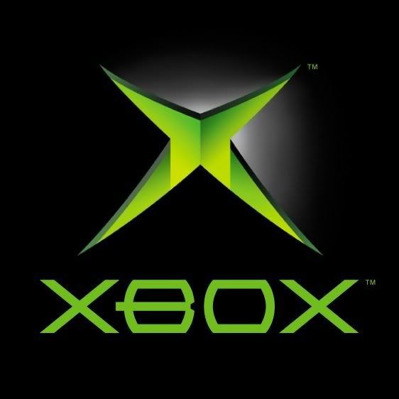
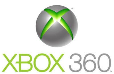
Simple right? the green gash that was used for the original Xbox. When its laid out in black its the original, for the 360 Microsoft paired it with white. You put the gash in a globe, add some nice colors and font and you get the Xbox 360 logo. A pretty, Web 2.0 identity that says "yes we're for hardcore gamers but we also care about families, we're not oppressive oligarchs like Sony but we're not pussies like Nintendo".
But the thing is that was not the original Xbox 360 logo. When it was released the overlying visual was the psychotropic, green-yellow-white-blue, moving, mind fuck spiral. When the 360 was released in 2005 Microsoft had that spiral everywhere, but after some time (and I couldn't tell you when) it went away, replaced by the sphere and the wordmark. Sure its still used today but its hardly the primary mark. So why did it went away? some thoughts below.
Firstly the spiral is impossible to reproduce, especially on a small scale. Imagine trying to get that thing on a polo shirt and have every individual strand appear as it does on a computer screen or a piece of paper? its impossible. Any logo needs to be reproduced on all sorts of scaled and the spiral simply does not work. Add to that the huge amount of negative space in it and the fact that that space probably has to be filled with white and you have a logo that is impossible to work with.
The X-gash is not only part of the visual identity but its actually part of the controller, going to it as the main visual simply makes sense from a marketing standpoint. The spiral, at most, is part of the box and the box gets thrown into the trash after you make sure your system works.
Could it also be that a spiral as a video game logo has been done before? specifically by Dreamcast? I suppose. Though the Xbox and the DC's spirals have very little in common, I'd say nothing except for the basic shape and the fact that they both appear on machines that are primarily white in color. The thing is that by 2005 the Dreamcast was obsolete, Sega was out of the hardware business and fear of litigation should have been minimal. It probably was since the Xbox spiral still technically is part of the larger visual package.
The answer is probably a short google search away and its probably not as romantic as the shit I'd like to believe so I'm just going to assume I'm correct in assuming that the logo's uselessness and its similarities to the Sega system ultimately killed it. In the end if I were Microsoft (and I'm not) I would have gone with the one visual that comes to everybody's mind when they think Xbox 360: the Red Ring of Death.
Oh Snap!
Thursday, December 3, 2009
A Downward Spiral
Subscribe to:
Post Comments (Atom)

0 comments:
Post a Comment